The Complete Guide to Building a High-Converting Website in 2026
Your website is working 24 hours a day, 7 days a week. The real question is: is it working for you or against you?
Most business owners pour hours of effort and thousands of pounds into getting a website live only to find it sitting there, looking pretty, but generating almost zero leads. The problem is rarely the design. It is almost always the strategy behind the design.
In this guide, we are going to break down every single element that separates a high-converting website from a digital dead end. Whether you are building from scratch or looking to improve what you already have, this is the most complete guide to website conversion you will read in 2026.
What Does ‘High-Converting’ Actually Mean?
A high-converting website does one thing exceptionally well: it turns visitors into action-takers. That action might be booking a call, submitting a contact form, making a purchase, or downloading a lead magnet. Whatever your business goal is, your website should be actively moving people towards it.
Conversion rate is simply the percentage of visitors who take your desired action. The average website converts at around 2 to 3 percent. A well-optimised site can achieve 5 to 10 percent or more. That difference, at scale, is the difference between struggling and thriving.
The 7 Non-Negotiable Elements of a High-Converting Website
1. A Clear Value Proposition Above the Fold
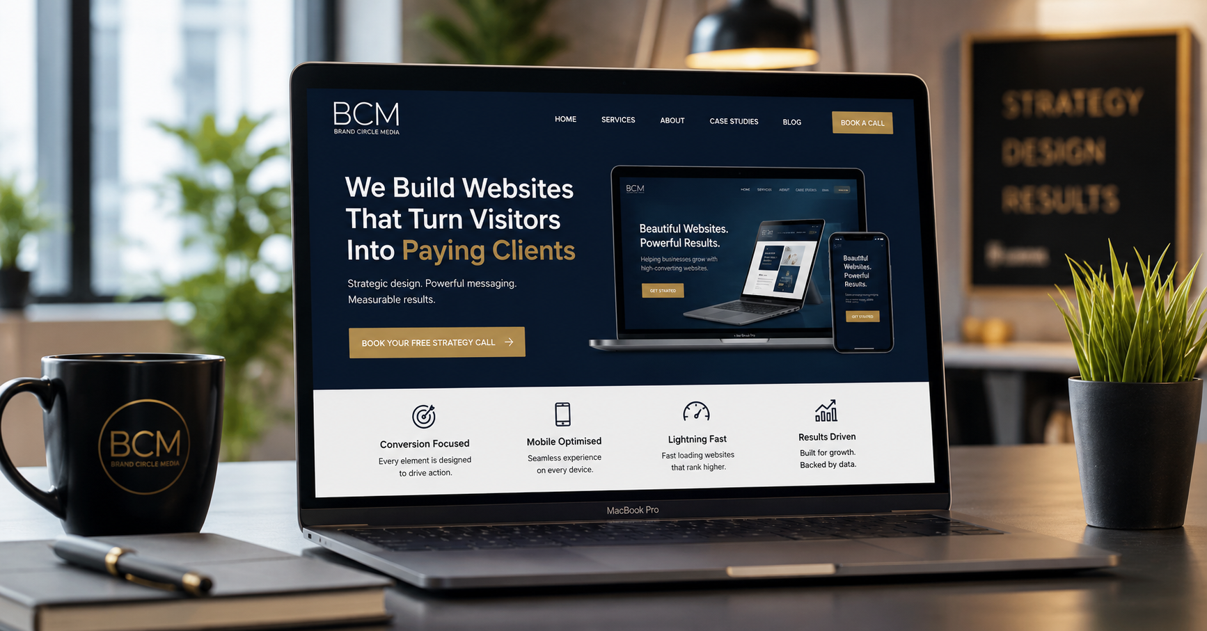
The ‘above the fold’ area is everything a visitor sees before they scroll. Within three seconds of landing on your site, a visitor should understand exactly what you do, who you help, and why they should care. If they cannot figure this out immediately, they will leave.
Your headline must be benefit-driven, not vague. Compare these two examples:
- Vague: ‘Welcome to Brand Circle Media’ tells the visitor nothing
- Clear: ‘We Build Websites That Turn Visitors Into Paying Clients’ immediately communicates value
2. Strategic Call to Action (CTA)
Every page of your website needs a clear, prominent call to action. Not buried at the bottom. Not hidden in your navigation. Front and centre, above the fold, in a colour that stands out from your background.
Your CTA should be specific and action-oriented. Instead of ‘Contact Us’ try ‘Book Your Free Strategy Call’ or ‘Get Your Free Website Audit’. Specificity increases clicks significantly.
3. Trust Signals and Social Proof
People buy from businesses they trust. Your website needs to demonstrate that trust immediately. The most effective trust signals include:
- Client testimonials with full names and photos
- Case studies showing real results
- Industry certifications or awards
- Media features or press mentions
- Number of clients served or projects completed
Place trust signals near your call to action and on any page where you are asking someone to make a decision.
4. Mobile-First Design
Over 60 percent of web traffic in 2026 comes from mobile devices. If your website is not designed for mobile first, you are losing the majority of your potential visitors before they even read a word.
Mobile-first does not simply mean ‘it works on mobile.’ It means your mobile experience is fast, easy to navigate, has tap-friendly buttons, and loads in under three seconds. Test your site on a real phone, not just the browser preview.
5. Page Speed
Google has confirmed that page speed is a ranking factor. More importantly, research shows that 53 percent of mobile users will abandon a site that takes longer than three seconds to load. Every second of delay costs you visitors and conversions.
The key areas that affect speed include:
- Image file sizes — compress every image before uploading
- Hosting quality — cheap shared hosting slows everything down
- Too many plugins — each plugin adds load time
- No caching — caching dramatically reduces load times
6. Compelling, Conversion-Focused Copy
Design attracts visitors. Copy converts them. Your website copy must speak directly to your target client, address their pain points, and clearly explain how you solve their specific problem.
The most effective website copy structure follows this pattern: identify the problem your client has, agitate that problem by making them feel understood, then present your solution as the natural answer. This is called the Problem-Agitate-Solution (PAS) framework and it is proven to convert.
7. A Simple, Logical User Journey
Your website should guide visitors through a clear journey, from awareness to action, without confusion or distraction. Every page should have one primary goal. Every element on that page should support that goal.
Map out your user journey before you design a single page. Where does traffic arrive? What do you want them to do first? What objections might they have? Where do you address those objections? What is the final step you want them to take?
Common Website Mistakes That Kill Conversions
Now that you know what a high-converting website needs, here are the most common mistakes that destroy conversions:
- Too many options — the paradox of choice causes visitors to choose nothing
- Generic stock photography — it signals inauthenticity immediately
- No clear next step — visitors do not know what to do, so they leave
- Slow loading times — every second costs you conversions
- No mobile optimisation — the majority of visitors are on their phones
- Weak or missing testimonials — trust is never assumed, it must be built
- Copy focused on features rather than benefits — clients care about results, not specifications
The Brand Circle Media Approach to High-Converting Websites
At Brand Circle Media, we have built websites for entrepreneurs, agencies, consultants and product businesses across the USA, UK, Canada and Australia. Every website we build starts with strategy, not design.
Before we touch a single page layout, we ask: who is this for, what do they need to feel to take action, and what is the clearest path from landing to conversion?
The design follows the strategy. Always.
This approach is why our clients see genuine results more enquiries, more bookings, more sales, rather than just a beautiful website that sits there.
Your High-Converting Website Checklist
Use this checklist to audit your current website or plan your new one:
- Clear value proposition visible above the fold on every page
- Primary CTA visible without scrolling on the homepage
- At least three trust signals on the homepage
- Mobile load time under three seconds
- Desktop load time under two seconds
- Copy is benefit-focused and speaks to your ideal client
- Every page has one clear goal
- Contact or booking form is easy to find and simple to complete
- All images have descriptive alt text for SEO
- SSL certificate active and site loads on HTTPS
Ready to Build a Website That Actually Works?
If you are looking at your current website and realising it is not doing its job, you are not alone. Most websites are built to look good rather than perform. The good news is that it is fixable and often faster than you think.
At Brand Circle Media, we specialise in building and redesigning websites that turn visitors into clients. Whether you need a complete rebuild or a strategic conversion optimisation of what you already have, we can help.
Book a free website audit with our team today and we will tell you exactly what is working, what is not, and what needs to change to start getting results from your website.